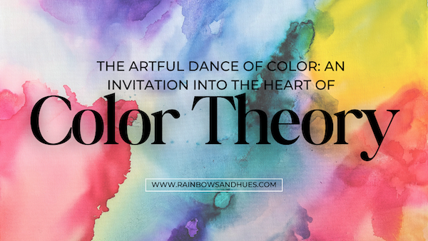
Color theory is a conceptual framework that explores how colors interact and how they can be combined to create visually appealing compositions. It encompasses principles and guidelines that help artists, designers, and anyone working with color make informed decisions about color combinations.
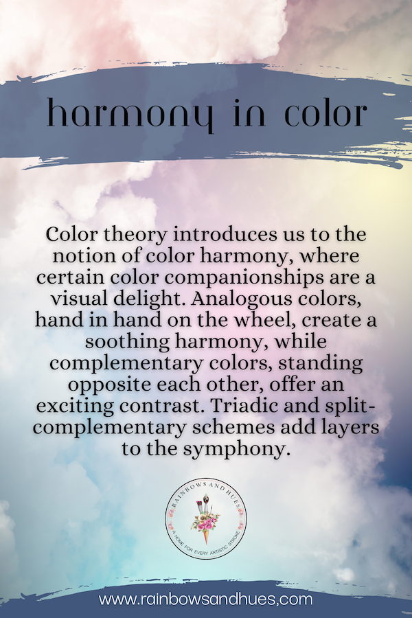
The primary components of color theory include the color wheel, which organizes colors based on their relationships, and concepts such as complementary colors, analogous colors, and triadic colors. Complementary colors, for instance, are opposite each other on the color wheel and often create a vibrant contrast when used together. Analogous colors, on the other hand, are adjacent to each other and usually produce harmonious, serene effects.
Understanding color theory is essential in various fields, including art, design, and marketing, as it enables individuals to evoke specific emotions, convey messages, and create visually appealing aesthetics. By applying color theory principles, one can achieve balance, contrast, and unity in their creative works.
Also Read: Unleash Your Creativity with Medium Density Fiberboard (MDF)
Embarking on the Color Journey
A color wheel is a circular diagram that organizes colors based on their chromatic relationship. It consists of primary, secondary, and tertiary arranged in a way that illustrates their connections. The typical color wheel comprises 12 colors.
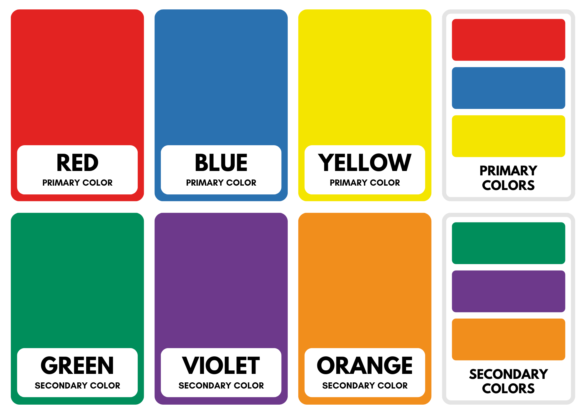
- Primary: These are the foundation colors that cannot be created by mixing other colors. In the traditional color wheel, the primary colors are red, blue, and yellow.
- Secondary: These colors result from mixing equal parts of two primary colors. The secondary colors are green (from blue and yellow), orange (from red and yellow), and purple (from red and blue).
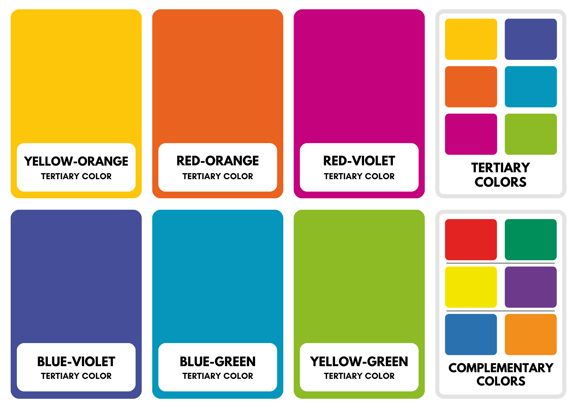
- Tertiary: These colors are created by combining a primary with an adjacent secondary. For example, red-orange and yellow-green are tertiary colors.
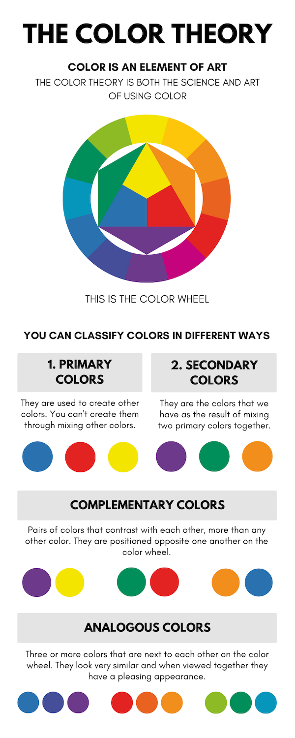
The arrangement of colors on the wheel helps artists and designers understand color relationships. Complementary colors, which are opposite each other on the wheel, create contrast, while analogous colors, which are adjacent, often produce harmony.
Also Read: Exploring the Different Types of Bristles in Painting Brushes
The color wheel is a fundamental tool in color theory, guiding the selection and combination of colors to achieve specific visual effects in various creative endeavors.
In the realm of color theory, tints and hues play pivotal roles in understanding and describing colors. For example, if you start with the hue blue and add varying amounts of white, you can produce a spectrum of tints, ranging from a deep, rich navy to a pale, sky blue. This manipulation of tints is a common technique in art, design, and other creative fields, allowing for a broad palette of colors that can evoke different moods and visual effects.
Also Read: Understanding Art Papers – 1
What are Hues?
Hues refer to the pure, undiluted colors on the color wheel. In simpler terms, a hue is a specific shade of a color without any added white, black, or gray. It represents the basic, most intense version of a color.
For example, if you look at red on the color wheel, the hue of red is the true, unaltered red. Adding white to red creates a tint (lighter red), while adding black results in a shade (darker red). The hue remains the core color before any modifications.
Understanding hues is crucial in colour theory, as they serve as the starting point for creating various tones, shades, and tints. Artists and designers often manipulate these hues to achieve desired effects in their work, playing with intensity and brightness to convey different moods and visual impacts.
What are Tints?
Tints are lightened versions of a colour achieved by adding white to the original hue. When white is mixed with a colour, it creates a tint, making the colour appear brighter and less saturated. Tints are often used to create a range of shades within a colour scheme, adding subtlety and variation.
For example, if the original hue is red, adding varying amounts of white will produce a range of pink tints. The more white added, the lighter the tint becomes. Tints are commonly used in art, design, and other creative fields to achieve softer and more pastel-like variations of colours, providing a versatile palette for different visual effects.
The Emotional Ballet of Color
Colors carry emotional resonance, whispering feelings and impressions. Warm colors—reds, oranges, and yellows—invite energy and passion, while cool colors—blues, greens, and purples—offer tranquillity. The emotional language of colors enriches our creative expressions.
An Ongoing Palette of Possibilities
In the expansive canvas of our visual experiences, colour theory emerges as a companion, gently guiding our brushstrokes. It empowers creators to tell stories with emotions, communicate messages with hues, and weave a harmonious tapestry of life. Whether you’re an artist, a designer, or someone navigating daily choices, embracing the principles of colour theory invites you to explore an ongoing palette of possibilities, transforming how you perceive and engage with the vibrant spectrum of existence.
Also Read: Lippan Art: A Unique Blend of Tradition and Craftsmanship
***
Hop over to our website www.rainbowsandhues.com to explore exciting offers on arts & craft supplies on our website! Follow @rainbowsandhues on Instagram to get regular information on new products and deals!